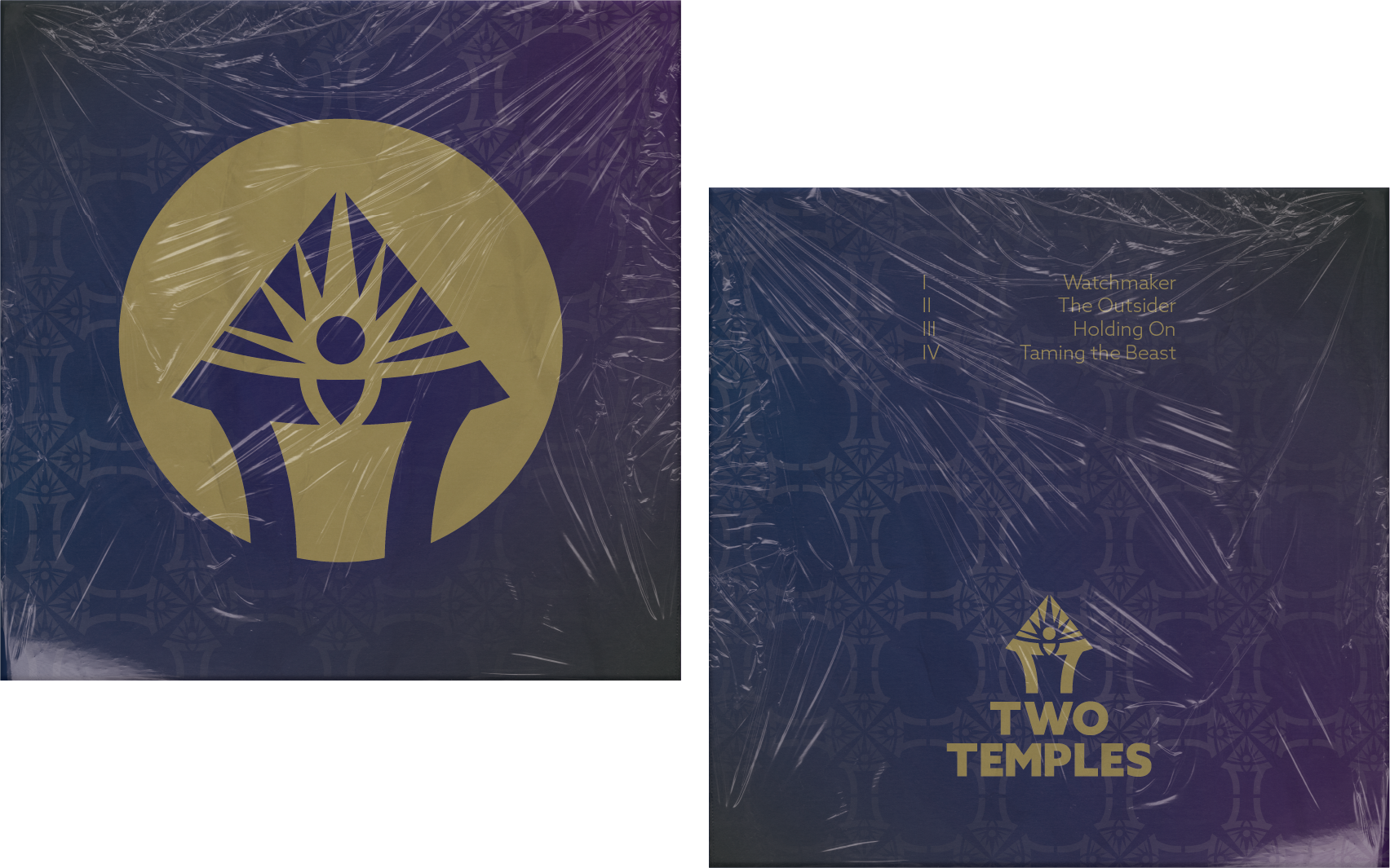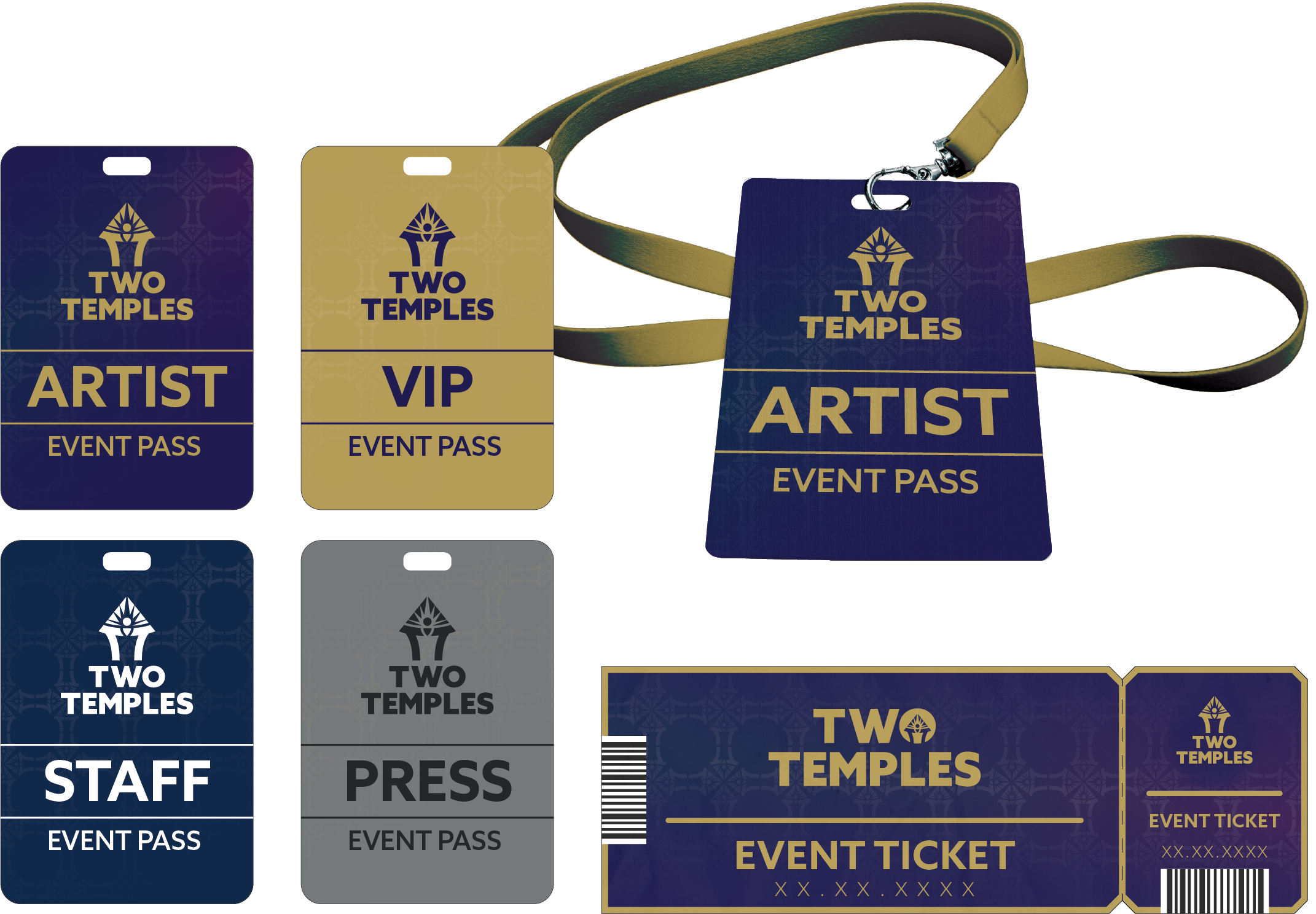
Two Temples is a music project with a strong connection to spirituality, duality, and self discovery. We created a visual identity that translates those themes into a distinctive, contemporary symbol — giving the artist a recognizable mark that can live across releases, digital platforms, merchandise, and live performances.
The goal was to create something visually simple and memorable, while holding a deeper meaning for those who choose to look closer.
SERVICES : Artist Branding · Logo Design · Visual Identity
We developed the identity around this central symbol, creating a visual language that could complement the artist’s music rather than overpower it. The geometric forms and symbolic details give Two Temples a flexible visual foundation that can evolve alongside the music , from artwork and digital content to merchandise and live applications.
THE STORY BEHIND THE LOGO
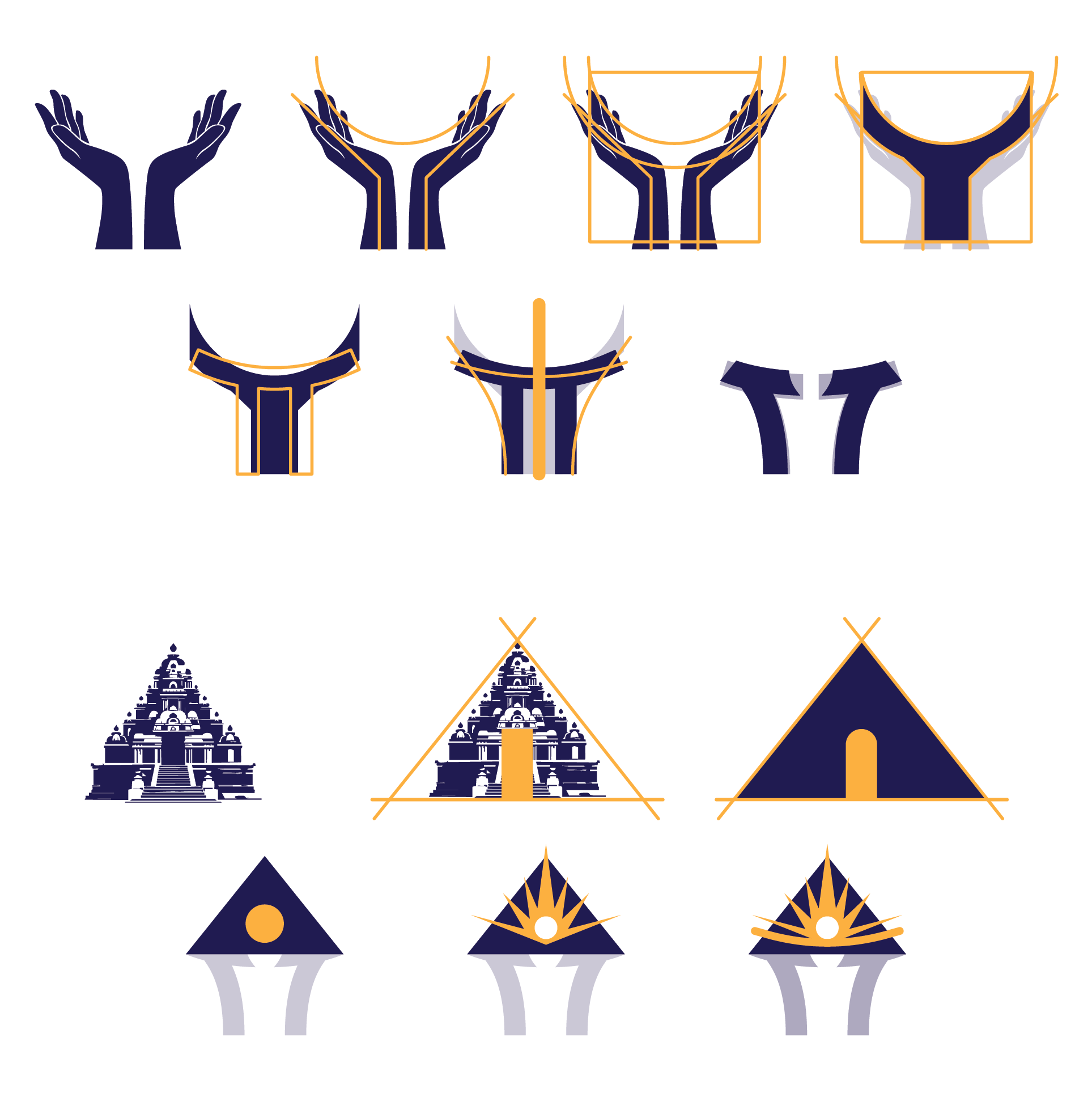
The Two Temples symbol is designed as a layered exploration of duality, connection, and transformation. Two mirrored “T” forms become a pair of raised hands, while their symmetry subtly references Gemini sign and the balance between opposing forces.
Above them, the pyramid and radiating circle evoke the temple, enlightenment, and a journey toward higher understanding. Hidden within the negative space, a human figure emerges, bringing the composition together as a symbol of awakening, self discovery, and transcendence.
Every element carries meaning, yet together they form one simple, recognizable mark.